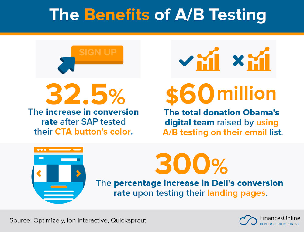
A/B testing is one of the core methodologies in more than most marketing tactics. And with good reason, as it allows marketers to make educated decisions rather than guesses when it comes to their next move.
( Source )
Especially when it comes to email marketing, A/B testing is one of the best ways to know what will improve your open and click-through rates and boost all the email analytics you're surely tracking as a marketer.
Of course, much like all marketing tactics, A/B testing comes with some challenges, and knowing where to focus is crucial. What should you test? How often? What is the best way to interpret your data?
Let's find out.
A/B Testing: A Definition
Before proceeding with the best practices for A/B testing, we should define the term. A/B testing, otherwise known as Split Testing, refers to the act of comparing how your audience responds to two versions of something, whether it's an email, a PPC campaign, or a landing page.
These two versions need to have one key difference. The audience doesn't need to be able to tell the two versions apart, but marketers definitely should.
If, for example, you'd like to figure out the email marketing templates that work best for your venture, make sure to use a fully customizable template, out of which you can create two variables. Then, send two test campaigns, one for each variable, and analyze the results.
This scientific approach will allow you to create email marketing campaigns, web pages, landing page content, and various marketing materials that can elicit an emotional response from your audience and resonate with them.
Generally speaking, A/B testing is one of the most cost-effective ways to determine what your audience likes to see when it comes to your brand and all its marketing efforts.
Of course, one would wonder, "Why should I use A/B testing when I have a plethora of data and AI and machine learning tools that can predict desires?".
According to Entrepreneur, " The best way to create a good user experience is to test your website or app with users ". The same goes for your email marketing campaigns, as you will be creating customer-centric content that can inform, educate, and create a bond between your brand and the customer.
Not to mention the competitive edge A/B testing can offer:

( Source )
Your competitors might not perform A/B testing correctly or even not use A/B testing software at all.
What Should You A/B Test in Email Marketing?
Since email marketing is undeniably one of the most affordable ways to promote your marketing message, testing just the right thing at the right time is crucial. And here's why:
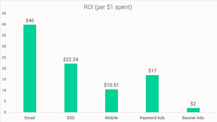
An ROI that is impressive means that creating non-tested, non-optimized emails is like leaving money on the table. But what are the components you need to test to boost your metrics?
Your Lead-Gen Efforts
To create an email list, you need to generate leads that will turn into subscribers who will, in turn, be willing to receive your email marketing messages. To do that, you'll need a tool that can help you create, A/B test, and optimize your lead-gen mediums, aka your landing pages and subscription forms.
A/B Testing Your Landing Pages
Let's start with your design efforts. The first thing a prospect will notice will be your landing page's design. Test its layout, colors, and any links you include on your landing page.
After that, make sure to test your typography, colors, and elements like customer testimonials and hero images. Are they comprehensive enough? Are they convincing? Is your message correlated to your design? What about your colors?
A/B testing will help you answer those questions.
As far as your copy is concerned, include your Unique Selling Proposition (USP). Create two variants of your USP and see which one answers the main customer question better: "Why should I use your product and not a competitor's?"
Your landing page is not the place to sell; you don't need long-form content. Keep it short and sweet and include customer testimonials if your A/B testing results show you that you need more compelling long-form content.
Finally, be mindful of your CTA button. Use colors that match your brand's tone and the landing page's cause, and use actionable verbs that can lead the user from point A to point B.
A/B Testing Your Subscription Forms
In some cases, asking for a prospect's name and email is enough, but this is not true for all types of businesses. For example, B2B businesses need more data to segment better and send different marketing messages to varying positions in the same company.
First of all, decide on the number of fields you could use for your form. Longer forms could mean higher opt-out rates, and popups could be intrusive for your audience. A/B testing the form and placement will show you your audience's preferences and lead your efforts in the right direction.
Your form design is also an essential factor in your lead-gen efforts. Some audiences respond well to GIFs, and some others prefer to be shown an example of what to fill in the form's fields.
Again, your subscription form is not the place to use long-form content. Let's assume you create an event registration form . In that case, you'll need your copy to be clear on the how, the when, and the why of this event.
If you'd like to be more convincing, add an image of a previous event or some FOMO like "Only X seats available/days left to register".
As far as the CTA is concerned, you need to test it, much like the landing page's CTA. Actionable verbs and relevant colors are the rule of thumb you need to keep in mind but don't underestimate the button's size.
Experiment with the color, the size, and the placement of your CTA button. Create a variant with a first-person narrative and a variant with a second-person narrative and see what gets clicked more often.
But let's assume you've nailed your A/B testing efforts for lead generation. Let's get to the email marketing messages.
Your Email Marketing Messages
Email marketing could be a costly marketing tactic that you should avoid without enough leads. The same goes for email marketing campaigns that are sent to a big chunk of your audience without some A/B testing first.
Your subject line is just as important as your sender address when it comes to increasing your metrics and scoring better open and click-through rates. A/B testing will help you improve those metrics in a data-driven way that makes sense to your business.
Your Subject Line
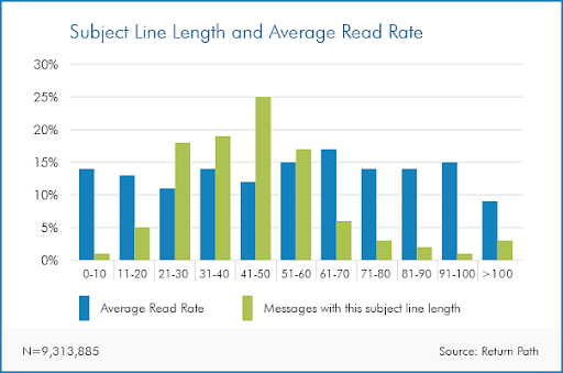
Starting off with what creates the first impression for your brand, an email subject line is there to convince the user to open your email. This means that, as a marketer, you'll need to be sure about the ways you can use the "free space" of the subject line. Here's what I mean:
( Source )
The optimal length is between 41 and 50 characters, but this doesn't necessarily mean that your audience wouldn't like a 60-character email subject line.
A sales campaign could benefit from a crafty sales subject line that could be 40 characters long, but what about a newsletter? So, create two variants and find answers to the following questions:
- Is the wording just right, too salesy, or too cryptic?
- Is your brand's tone on par with your marketing message?
- Could you go longer or shorter? What does this look like on various email clients and devices?
- How much personalization is enough for my subject line?
- Do I need to use emojis, or is my audience not familiar/not interested in that?
- Am I using actionable words?
- Am I leading the user down the right path?
Optimizing your subject line in such a way can make the difference between your email just being delivered or being delivered and opened.
Also, make good use of the words you have at your disposal. Steer clear of words like "Free" or symbols like "$$", as they can trigger spam filters.
Your Campaign's Content
Your campaign's copy and overall content are what will keep the user engaged and keep your click-through rates at an all-time high. So, at this stage, it's time to answer some more questions:
- Is my campaign meant for long-form or short-form copy?
- How many images could I use in this email?
- Are images enough as visuals, or would perhaps a testimonial video do? How about GIFs? Maybe those are needed as well?
- Is my typography good enough for my marketing message and my brand's tone? Is it too bland or too much?
- Are the colors sufficient and appropriate?
- Should I use bare links, buttons, or both?
The length of your copy might seem ideal for your campaign, but it could be too long or short for your audience. What is more, your brand's tone may not allow shorter or longer copies. To determine that, you need to A/B test and experiment with both longer and shorter forms, as well as more business-like or more friendly content.
And when we say content, we're also talking about visuals. Use powerful images or GIFs and see how your audience reacts to them. Maybe your recipients won't love your decision, or maybe they'll love an infographic instead of a header image.
Your Call to Action
Your Call To Action (CTA) button shows the course of action your user should follow to obtain what the email promises, whether it's an offer or just plain information.
So, what do you need your users to do next? This is the time to be crystal clear with your message. So, ask yourself:
- Where would my CTA convert better? Do I need two buttons instead of just one?
- How should I word this? Is an actionable verb enough, or do I need more than a couple of words for my button?
- What color would work best? Red is for taking action, but does it match my brand's tone?
The CTA will show your users how to proceed and what they'll get if they follow your advice. So, it's crucial to use all elements to your advantage, from expert color psychology to various puns and creative wordplay.
Contrasting colors is a fantastic idea when it comes to your CTA button. They can draw attention and make it pop. But this doesn't mean that your audience will love it. The same goes for your CTA button's size. The recipients need to be able to click on it through any device, but what is the actual size that makes them want to click anyway? And the same can be said about the position of your button. Some people would like to know what to do immediately, while some others would prefer to be nudged in the right direction.
More Email Marketing A/B Testing Tips
While A/B testing for email marketing specifically will give you a competitive edge, you need to consider some best practices that apply to all cases.
A/B testing can be a complex process if you don't know what to do. So, let's see the tips that can't be missing from your strategy.
Don't Test More Than One Variant at a Time
Testing multiple variants is possible, but A/B testing is not built that way. Since you need to test one hypothesis and not all of the variants that could make a difference and set your group A and group B. After that, start sending.
Make sure to test for one variant at a time. If you send an email marketing campaign with two variants with a slightly different subject line and an almost-same CTA, you won't know which component made a difference to your audience. Hence, you won't be able to determine which variant is better for your CRO efforts .
Test for Your Audience First
Knowing what component to change means you have a great understanding of your audience. And this is what will make a difference in the end. Remember, you're not testing for your brand; you're testing for your brand in relation to your audience.
This means that you need to be aware of the components that would drive change down the line and be statistically significant for you.
Of course, to achieve a result you'll be sure of, you'll need to test for all metrics and stages of the funnel. Your CTR might be necessary, but it's not the end-all-be-all.
To create content that will give you accurate results, you need to be aware of your audience and the stages of the funnel you're testing for. For example, using UGC on a repeaters' A/B testing email marketing campaign is not exactly the way to go.
And you need to consider more than just demographics to be able to make educated, data-driven decisions.
Run Multiple Tests at the Same Time
Since you're testing two variants of the same marketing message, you can't afford to waste time and test for variant X this week and variant Y the next.
The reason behind this is that the more time passes, the less valid your data will be, as they can be influenced by the time period you obtained them.
Running your tests simultaneously eliminates the possibility of time working against you and your testing.
Of course, to ensure that no components will influence your data and that you'll be able to draw accurate conclusions, never test on audiences that are not equivalent or similar. If you're testing for maternity clothes, you'll need to test on your "mother" demographic, no matter the variant you've decided to change.
That way, you'll know what made the difference between a good and a great open rate and whether an emoji on your subject line or a red CTA button boosted your sales conversion rate.
Nothing Is Too Small to Test
If we're talking about successful A/B testing, nothing is too small or too random to test. Of course, everyone will think of things like the CTA button or the subscription form fields first, but there are things just as important that you will need to test down the line.
Testing for send times, different target audiences than what appears to be your main target, and different promotions to see what is off-season and what works for your audience can give you more insight into consumers' spending habits. This is what will, eventually, make for a great email marketing campaign.
At this stage, you could combine the power of an A/B testing email campaign and a questionnaire to boost your data and make accurate decisions.
The Takeaway
Now you know how and why you should conduct A/B testing for your email marketing campaigns. But before you do so, make sure A/B testing is what will work for your audience and its size.
Remember, A/B testing tools are still tools, and maybe your audience's size allows your content to be optimized using more straightforward methods, like a survey or a social media quiz.
However, if it's time for you to create your first A/B testing campaign, follow the tips above, and see your conversion skyrocket.


