Have you ever received an email with poor color contrast that made it difficult to see the text? Or was the information unclear even with alt text? In what way did you use that email? You undoubtedly closed it and moved on to the following email.
If you want to build a strong relationship with your customers, you must follow the accessibility best practices. Since email brings the maximum ROI of $38 for every $1 spent, you must pay special attention to your email marketing strategy and make it accessible to everyone.
Let’s look at some intriguing facts and statistics about accessibility.
AbilityNet has revealed that 90% of public and commercial websites are not accessible to people with disabilities who depend on assistive technology. According to the World Health Organization (WHO), approximately 15% of the world’s population lives with some form of disability. Besides people with disabilities, accessibility includes the elderly, people with temporary disabilities, subscribers using small screens, and those with slow Internet speeds.
By 2060, the geriatric population is expected to reach 98 million in the U.S.
Importance of Email Accessibility
Accessible emails will help reach a larger audience.
Making your emails accessible will allow you to reach a broader audience, including people with disabilities, the geriatric population, and others who might find reading your content challenging. Moreover, emails have a 90.3% penetration in the U.S. Therefore, you can conveniently predict that creating accessible emails will increase your audience base. It is important to note that many businesses are legally mandated to send accessible emails under the Americans with Disabilities Act (ADA). You can learn more about more about sending ADA compliant emails in this piece.
It will enhance your brand credibility.
Very few brands send out accessible emails at present. Early adoption of this strategy will build your brand reputation and help you stay ahead of the curve. It will also improve your brand recall.
Accessibility will improve the customer experience.
As accessible emails are easy to consume, they eliminate the friction that hampers subscriber engagement. It leads to improved customer experience, leading to better engagement and higher conversions.
Conditions to Consider While Creating Accessible Emails
Yale University has defined five main disability types in its Accessibility policy, namely:
Visual
Visual disability comprises:
- Mild or moderate vision loss in one or both eyes
- Substantial or complete vision loss in both eyes
- Sensitivity to some colors or color blindness
- Sensitivity to brightness
Auditory
Mild to moderate hearing impairment in one or both ears falls under auditory disability. People might find it hard to access audio content with partial loss or difficulty hearing.
Cognitive
Cognitive disabilities affect how people can process and comprehend information. These encompass a range of behavioral and mental health disorders.
Speech
The inability to produce speech that is discernible by other people or software is considered to be a speech disability.
Physical
Weaknesses and limitations of muscular control are known as physical or motor disabilities. Involuntary movements like tremors, lack of coordination, paralysis, limitations of sensation, joint disorders like arthritis, pain that limits movement, and missing limbs also fall in this category.
Now that you have a basic knowledge about the kind of disabilities let’s understand how to make your emails accessible to everyone, regardless of their limitations.
A Methodical Approach to Email Accessibility
We shall cover the topic in four broad headings.
- Accessibility to the email inbox
- Making email content accessible
- Designing accessible emails
- Coding of accessible emails
Let’s get started.
Accessibility to The Email Inbox
Besides the sender name, the subscribers will check the subject line and preheader before opening your email. Creating accessible emails starts right here.
1. Your subject lines and preheader text should be simple, descriptive, and not too long. They should let the recipients know what the email is about and encourage them to open it.
2. While using emojis, consider the people using assistive technology to read your emails. Your email might lose its essence for such subscribers. The best idea is to add a single relevant emoji at the end of your subject line. (as shown in the screenshot below.)

Avoid using multiple emojis or a single emoji, which may have different interpretations in different tools. Do not change its color, as the assistive software will read aloud the color descriptor.
3. Magnifying tools will find reading words written in all caps confusing. Also, they are difficult to recognize by shape. Some screen readers will interpret the word as an acronym and read it letter by letter. Therefore, you must refrain from writing in all caps.
Making Email Content Accessible
Subscribers and screen readers should find it effortless to read your emails. Keep the following points in mind to make the email content accessible.
Write a concise copy: Most subscribers skim through your emails and look for valuable information to take away. This might not seem too difficult. However, people using screen readers and assistive technologies will find it daunting to get the gist of your emails if it is too wordy. The same holds for people with shorter attention spans. So, keep your emails as concise as possible.
Keep the sentences short and straightforward: Improve your email’s readability with lucid and jargon-free language. Not all subscribers will know your language at a native level. So, it is advisable to take an inclusive approach while choosing the words.
Do away with generic hyperlink text: Go for more specific phrases rather than hyperlink text like “click here.” Use a descriptive hyperlink text that lets the audience know where they will land after clicking the link. For example: “Here, you will find DeBounce’s complete guide to email deliverability>>” works better than generic phrases.
Do not reference images in text: Suppose you have referenced an image in your email copy. It will create a problem for people who cannot view your email. Also, it will mislead the subscribers by using devices that do not support your message or have images blocked by default. You must not reference any visuals within the body text to avoid such a tricky situation.
Designing Accessible Emails
Design emails that are easily understandable by subscribers and screen readers alike. Here are some tips to guide you.
1. Follow a logical reading order
Tables are used to code email templates as it is the best way to ensure flawless rendering across the desktop, webmail, and mobile email clients. Thus, your content order is of paramount importance. Assume that 10% of subscribers on your list use screen readers to read the emails. If your content sequence does not follow the left-to-right or top-to-bottom reading order, the screen reader will read content haphazardly. Consequently, the subscriber will be unable to make much of the random content. The image below represents the order in which the content is read.
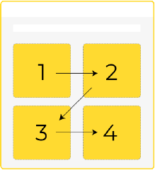
Maintaining the correct flow becomes all the more important for responsive emails. The safest bet is to use a single-column layout to ensure that your emails do not meet a sad fate.
2. Choose a suitable text and background color
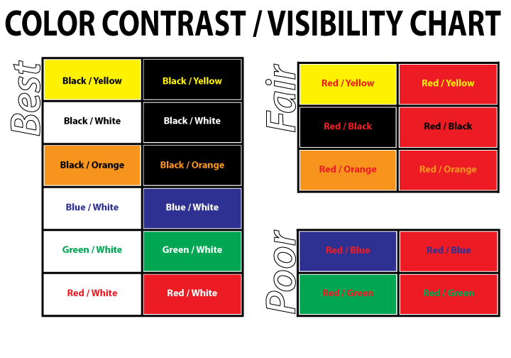
The ultimate way to design perfectly readable emails is to use dark text on a light background. This combination imparts a pleasant reading experience to the users. Alternatively, you can use a dark background and light text that emulates dark mode settings and consider incorporating high-quality background images to enhance the visual appeal for your audience, especially those who suffer from photosensitivity. An ideal contrast ratio between the text and background is 4.5:1 or greater than that for small fonts and 3:1 for large font sizes. You can use several tools to check the color contrast ratio. Some of them are Contrast Ratio, Contrast Finder, Monsido, and Coolors. Take a look at this chart to understand how to use the right colors in your email. Ensuring a sufficient contrast ratio improves readability and accessibility, allowing all users to engage with your content effectively. These color contrast tools allow you to select the optimal colors that meet the recommended ratios for different font sizes.
3. Align the text toward the left side
More often than not, we are tempted to align the text in the center or justify it. This is a mistake from the accessibility point of view. Left alignment works best when you want to create an inclusive user experience. Other alignment methods are not suitable for dyslexic individuals. Furthermore, the justified text is not compatible with some email clients and can lead to rendering issues.
4. Use simple fonts
Pick the fonts that are legible for all subscribers. It is best to use web-safe Serif or sans-serif fonts. This does not mean that you should never use custom fonts. You can use fancy or decorative fonts during the Holidays or on special occasions. Ensure you provide an appropriate fallback for email clients not supporting these fonts. Whenever you add a custom font to an email, the rendering engine will first check whether the recipient’s device has the custom font installed on it. If not, it will check for the first fallback provided by you in the code. If this font does not exist on the device, it will render the second fallback.
5. Set a short line length and proper line height
45 to 75 characters are the recommended line length. If the line length is too long, the subscribers cannot concentrate on the copy. On the other hand, shorter line length will break the reading rhythm as readers will have to return to the left again and again to read the next line. The best way is to have short paragraphs, headings, bullet points, and images to break the text into readable chunks. The ideal line height should be 1.5 times the font size. Keeping the lines too close can cause unnecessary strain on the reader’s eye. They might miss out on a line and move on to the next. Contrarily, if the lines are further apart, there will be a disconnect between the two. Here’s an example from Email Uppers that has a 15pt font size, 25pt line height, and 71-character line length — all in sync with the accessibility best practices.

6. Add enough white space to your emails
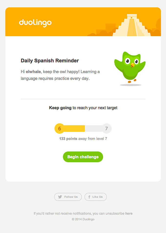
Give the readers breathing space by adding ample white space to the emails. It will make every element distinctly readable. Avoid too much clutter in your email so that the purpose of the email does not get concealed. Typographic margins and paragraph spacing can make the emails more readable. Check the minimalistic reminder email by Duolingo that instantly connects with the reader and prompts them to continue learning.
7. Use visuals judiciously
Just because you can doesn't mean you should! This applies perfectly to visual email marketing. Use visuals only as needed. Many marketers add GIFs to every email. While they enhance the visual appeal of the emails, they might lead to accessibility issues. GIFs with animations between 2 and 55Hz can harm photosensitive people. So, you should avoid using GIFs with bold colors, patterns with high contrast, and flashy content. Make sure that the transitions are smooth and that you have a relevant Alt-text for every visual. Alt-text will let the screen readers know what the image is about. It will also be helpful for email clients that have images blocked by default.
8. Make the CTA buttons easy to click
Your CTA button must be noticeable. Having plenty of white space around the CTA helps in this endeavor. To design an accessible CTA, you must use a strong color contrast and make it clickable with a keyboard. Add clear labels that are in line with the CTA text. The size of the CTA button should be 44x44 px, according to WCAG. Google recommends it to be 48x48 px. Test the CTA button and check whether it is easily accessible to everyone. Make it large enough to be tapable on mobile devices, too.
Coding of Accessible Emails
Email accessibility does not apply only to people with special needs. It makes your emails easy to consume for everyone. Here are some tips to keep in mind while coding accessible emails.
1. Set table roles to “presentation”
As mentioned previously, it is important to maintain a logical flow of the email content. By setting the table roles to presentation, the screen readers will take the help of Assistive Rich Internet Applications (ARIA) to read the table in a way that makes perfect sense. If you forget to set the table role, the screen reader will read out the HTML code and ruin the user experience.
2. Use semantic tags
Semantic markup helps determine the flow and hierarchy of your email template. Using paragraphs, lists, and headings like <p>, <ul>, <ol>, <h1>, and <h2> will guide the screen readers through the email content in the correct sequence. You must apply the margins for each element and set different styles on the parent element for all the paragraphs to reflect the code.
3. Code emails are compatible with keyboard access
Physical disability or vision impairment can limit the usage of the mouse. To cater to subscribers who cannot see the mouse pointer on the screen, you must code emails that can be accessed with the keyboard. Take the help of a professional who can add custom-made controls, CSS styles, and scripts that facilitate navigating emails through the keyboard.
4. Include the “lang” attribute
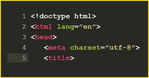
Screen readers will read the emails in the default language set on the device. To avoid any incorrect interpretations and pronunciations, you must specify the language of your email with the help of the “lang” attribute. For instance, If your email is in French, use lang=”fr” on the wrapper element inside the <body>. You can also use it as an <div> encompassing the entire email copy. You must also set the language in the <html> element.
How to Check Emails for Accessibility?
All these tips will help you create accessible emails, but it is still possible that you will miss out on something. Here are some tools that will help you check your emails for accessibility.
Accessible-email.org
This tool is used to check the accessibility of your emails exclusively. Just add the HTML email, and it will instantly assess headings, alt text, table roles, lang attribute, CTA, and link labels. Based on these insights, you can make the necessary changes.
Apart from this tool, you can also use some web accessibility tools to evaluate your emails.
- Web Accessibility Evaluation Tools List by W3C
- Accessibility Insights
- Accessible Metrics
- WAVE
- List of Accessibility Tools by Apple
- The axe DevTools extension
- Google’s Accessibility Developer Tools extension for Chrome
- AChecker
Wrapping Up
Let me sign off with an example of a completely accessible email that perfectly follows all the accessibility best practices and guidelines.
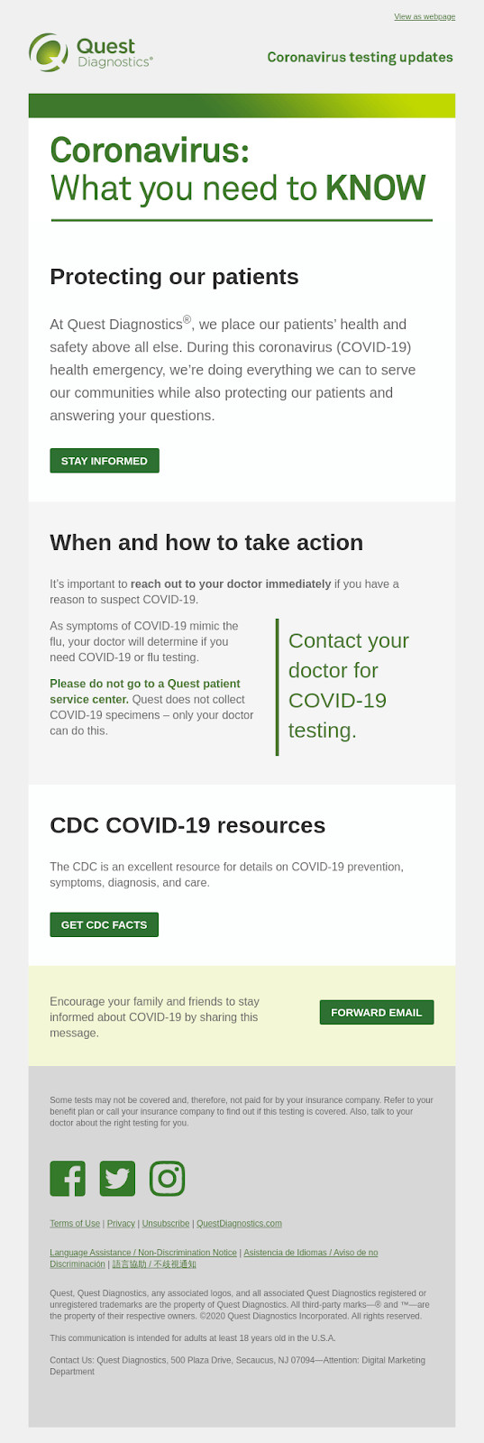
The email ticks all the checkboxes in the email accessibility checklist.
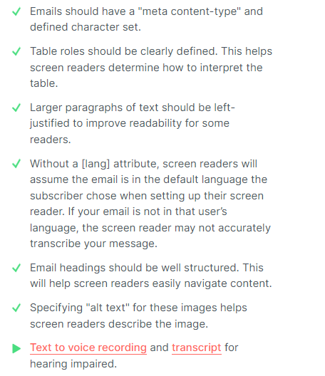
Source and Litmus testing


![Mail Merge Explained: Definition, Uses, Tutorial [2025]](https://ik.imagekit.io/debounce/wp-content/uploads/2024/06/mail-merge-explained-300x139.png)
